A website that is not working well does not automatically belong in the bin. The first problem is often the message, the imagery or the next step you ask of a visitor. Those things can sometimes be fixed without rebuilding everything.
I recently reviewed two very different websites: one for bathroom renovations and one for helping young basketball players study and play in the United States. Their industries were different, but the problems were similar. Strong arguments were buried, the images told the wrong story and the main button asked for a meeting too early.
The examples below are reconstructed and fully anonymised. They are not published case studies and no measured increase in enquiries is attached to them. They show the way I think during a website review.
Four questions the first page must answer
I do not begin with the colour of a button or a technology choice. I first check whether a new visitor can quickly understand:
- What does this business offer?
- Is the service meant for me?
- Why should I trust this company?
- What can I do now without committing to too much?
If one answer remains vague, interested visitors can leave even when the design looks fine.
1. The first headline explains nothing
“Your success is our concern” and “Quality you can trust” sound polished, but they could sit above almost any website. A useful headline names the service, the audience or the benefit that matters most to this customer. Clarity is more valuable than a clever slogan.
2. The best argument is hidden at the bottom
Information about a faster process, a guarantee, specialist experience or a distinctive method is often placed below the fold or on an About page. Not every detail belongs at the top, but the strongest reason to continue reading does.
3. The photo shows the process, not the result
Images occupy much of the first screen and shape expectations immediately. Someone looking for a new bathroom usually wants to see a finished bathroom, not people discussing drawings at a table. For a consultancy, a sports-shop look can hide the serious service behind it.
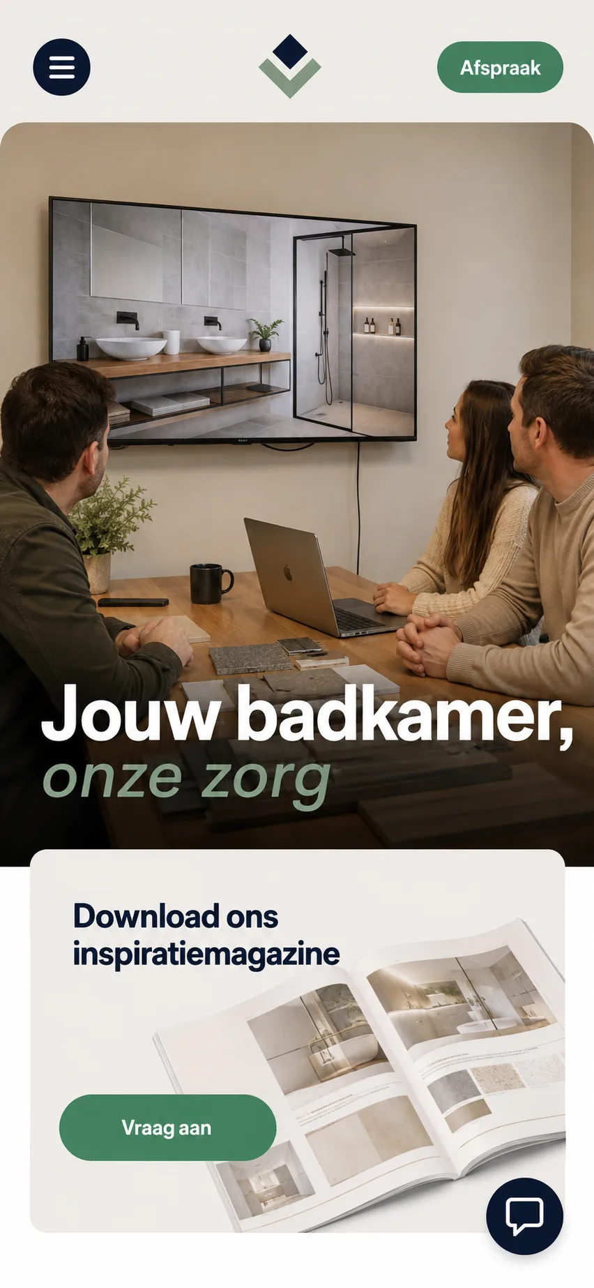
A reconstructed example based on a real website review. Names, people and contact details are fictional.
4. The button asks too much or too little
A new visitor is not always ready to book a call. They may not yet know whether the service fits, what it costs or what the conversation delivers. A generic magazine download can be too distant from the buying question as well.
The right next step depends on the service: a short suitability check, an initial calculation, a few focused questions or a review with a clear outcome. The button should help a decision, not merely collect an email address.
5. Trust appears after five scrolls
Reviews, completed projects, experience, guarantees and clear conditions are often hidden far down the page. Doubt starts much earlier. Use only genuine, checkable evidence. A polished design is not a reason to invent numbers, partnerships or testimonials.
6. The service area and audience are unclear
A local company should state where it works. A specialist service should make its audience recognisable. “For Dutch basketball players who want to combine study and sport in the US” says more than a broad slogan about dreams and borders.
7. Different audiences get the same route
Some services involve more than one decision-maker. A player thinks about development and life abroad; a parent wants clarity about guidance, cost and safety. One story and one button rarely answer both sets of questions. Two visible routes on one page are often enough.
8. The visual style sells a different kind of business
Design creates an expectation before anyone reads the copy. A strong sports style can suit a team or tournament but make a high-responsibility guidance service look like a club or shop. Random photos, mixed typefaces and blocks from different templates can also make a skilled professional look cheaper than they are.
9. Everything is changed at once
After a few years the wish list can include new photos, better copy, a different menu, faster pages, more reviews and new buttons. Doing everything at once takes time while the main mistake may remain.
I start with what determines whether someone understands the offer: the message, the right image, enough trust and a logical next step. The rest follows.
Example 1: a bathroom renovation website
The original page used a general headline, a meeting photo and a prominent magazine download. The renovation method’s strongest benefit and the service area appeared much later.
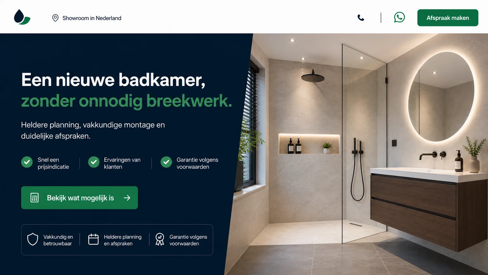
This is a proposed direction from a review, not a published website or a case with measured growth.
The improvement is mostly about order: offer and result first, then trust and a suitable action. The new colours are secondary.
Example 2: guidance for studying and playing in America
The second website offered an expensive, high-responsibility service but looked like a sports brand. A large English slogan set a mood without explaining the combination of basketball and education in the US. Players and parents followed the same route, and the main button immediately asked for a meeting.

The brand, athlete and visual details are fictional.
The proposed direction was to explain the service directly, separate player and parent routes, offer a first possibilities check, show relevant experience that can be supported and make the design feel like professional guidance.
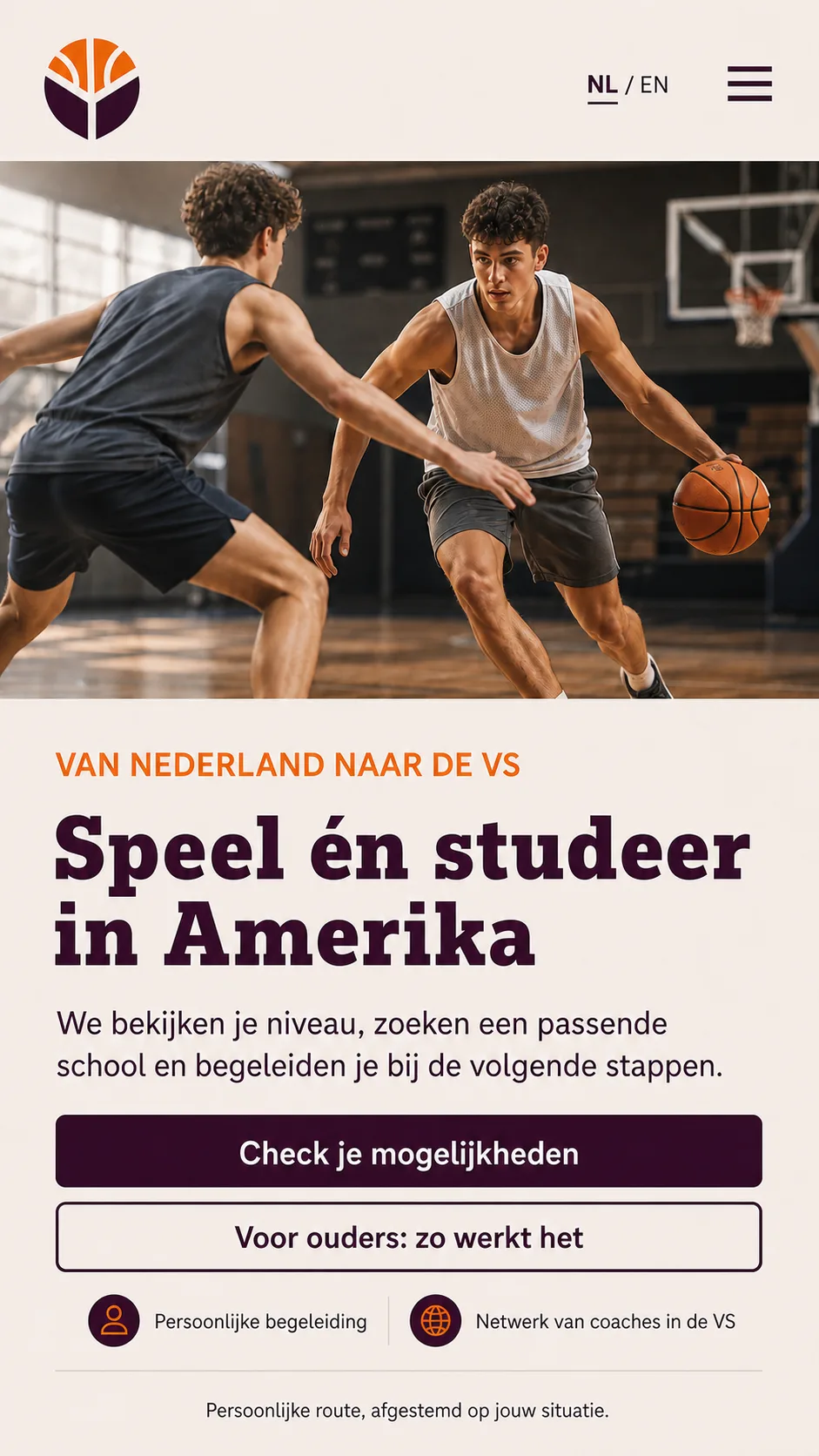
A concept direction only. It contains no real schools, names, partnerships or result promises.
When can you improve the existing website?
Focused changes make sense when the website is stable, the main pages can be edited and the problem is concentrated in the offer, first screen, imagery or contact route. Sometimes the home page and a few service pages need rebuilding while the technical base stays.
A full rebuild becomes more sensible when an old builder blocks simple changes, the site is assembled from unrelated pieces, the mobile version needs repairs everywhere or the structure no longer matches the services. Age alone does not decide it. I want to know what can be kept and which limitations would remain.
Why I sometimes need access to the admin
The public pages show the offer, structure, imagery, trust and contact route, but not how much technical work a change requires. Two similar-looking sites can use completely different systems behind the scenes.
I first identify where the visitor gets stuck, then check whether the current system can support the desired fix. Only then can I advise whether to continue with the existing site or start a new foundation, with a clear approach, schedule and price.
A good website review gives you an order
You should leave with answers to five questions:
- What does the visitor fail to understand?
- Which changes have the highest priority?
- What can stay?
- Can the current system handle the changes?
- Is a partial update enough, or is rebuilding wiser?
Two sites with the same visible problem can need different solutions. A vague headline may be the cause, or merely a symptom of an unclear service or the wrong audience arriving from ads.
Full site check for €100 excl. VAT
For €100 excl. VAT I review your current website, put the improvements in order and include a video explaining my findings. If you continue with OROS for improvements or a new website, the €100 is credited to the next project.
Want to improve your current website?
Ask Daniel to review your current website. I look at the offer, imagery, trust and next step, and then put the work in a sensible order. If the main problem is outside the website, I will say so before you spend money on work that cannot solve it.
About the author

Daniel Orosz
Daniel builds websites and digital systems from Kerkrade. He has worked with web technology for more than 16 years and explains complex choices in plain language.
More about Daniel →